24 Causal inference
He is wise who bases causal inference
on an explicit causal structure
that is defensible on scientific grounds.Aristotle (384–322 BC)
The previous chapter on prediction (Chapter 23) showed how we can anticipate outcomes from data — but a good prediction need not tell us why an outcome occurs, nor what would happen if we intervened. We learn that “correlation does not imply causation”, but not what positively would imply causation. More importantly, we really would like to understand why things are what they are. For ultimately, we need a causal understanding of the mechanisms governing our environment in order to gain control over them.
When studying correlational data, the human mind often intuitively imposes structure — which we embrace as a feature, rather than a bug. However, EDA and statistics lack the tools for dealing with causal structures. We need a language and methodology to ask and answer causal questions.
Understanding causal concepts and corresponding models will allow us to think beyond data. Essentially, this addresses and uncovers the data generating process. It also assigns a clear role to our own interpretation and understanding of data, rather than relying on a vague hope that data will eventually reveal itself. Especially when analyzing large sets of data (which may often be observational in nature), we will see that qualitative assumptions are important for the interpretation of results and the conclusions that can be drawn from data.
Please note
This chapter currently is in an early drafting stage — mostly a collection of notes and ideas, and a placeholder for future content. However, it contains useful links to better resources.
Preparation
Recommended readings for this chapter include:
The Causal inference in R blog, the Causal inference in R workshop and the corresponding book Causal Inference in R (by Malcolm Barrett, Lucy D’Agostino McGowan, and Travis Gerke)
Introductory articles by Lübke et al. (2020) and McGowan et al. (2024)
Background articles and books by Judea Pearl (e.g., Pearl, 2009; Pearl et al., 2016; Pearl & Mackenzie, 2018)
Preflections

- What is the case? Which associations can we see in our data?
- What happens if we intervene and actively change something?
- What would have happened otherwise — in a counterfactual world?
24.1 Introduction
Having discussed “data”, “science”, and “statistics”, is “causal modeling” just another confusing term? On the contrary,
it will anchor the elusive notions of science, knowledge, and data
in a concrete and meaningful setting
Main reason: Data does not reveal itself.
Playing a round of “good cop, bad cop”:
- The bad news is:
Data are profoundly dumb
We need to organize observations and provide structure — go beyond data.
- The good news is:
You are smarter than your data
24.1.1 Data and tools
Using functionality from the ggdag package (Barrett, 2024) and data from the quartets package (D’Agostino McGowan, 2023):
See the online documentation for details on the quartets datasets.
The R packages used in the book Causal Inference in R (by Malcolm Barrett, Lucy D’Agostino McGowan, and Travis Gerke) can be installed as follows:
# install.packages("pak")  # utility tool for installing sets of R pkgs
pak::pak(c(
  "r-causal/causalworkshop",
  "r-causal/ggdag",
  "r-causal/halfmoon",
  "r-causal/propensity",
  "r-causal/tipr",
  "LucyMcGowan/touringplans"
))

# Note that this installed 48 packages.
Color settings:
24.2 Essentials
Detecting patterns is the realm of statistics. Causal models go beyond the data by imposing a structure.
24.2.1 Causal inference
The ladder of causation distinguishes 3 rungs/levels of analysis and insight (Pearl & Mackenzie, 2018):
see: Detecting associations/Observing patterns in data: What corresponds to seeing \(x\)?
do: Performing interventions: What if I do \(x\)? How?
imagine: Counterfactuals enable understanding: What if I had done \(y\) instead? Why?
Examples
Examples from Pearl & Mackenzie (2018):
Causal diagrams provide a representation of scenarios, but also allow for reasoning: Working out the effects of observations, interventions, and counterfactuals.
Diagram with deterministic edges:
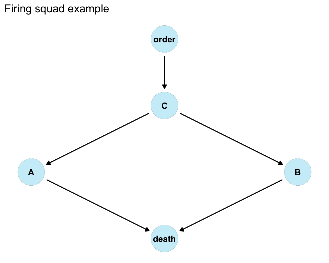
Reasoning through effects of:
- observation: If prisoner is observed to be dead, was the court order present?
- intervention: What if A decided to shoot?
- counterfactual: What if A refused?
Diagram with probabilistic edges:
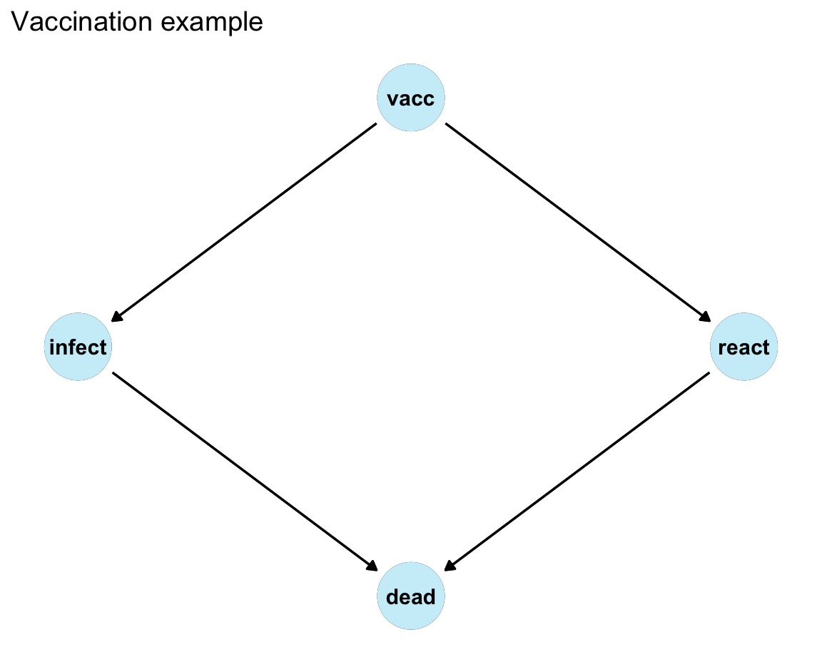
Value of counterfactual reasoning:
- If a vast majority of the population is vaccinated, it seems that vaccination kills more people than the disease.
- However, if nobody was vaccinated, the disease would cause far more deaths.
24.2.2 A causal quartet
Guiding question:
- Can we infer the causal mechanism (i.e., the interplay between causes and effects) from the data (values of variables)?
An introductory example from McGowan et al. (2024):
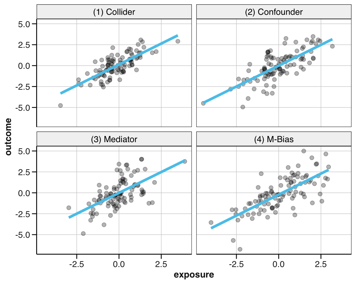
| dataset | ate_x | ate_xz | cor |
|---|---|---|---|
| (1) Collider | 1 | 0.55 | 0.7 |
| (2) Confounder | 1 | 0.50 | 0.7 |
| (3) Mediator | 1 | 0.00 | 0.7 |
| (4) M-Bias | 1 | 0.88 | 0.7 |
| dataset | ate_x | ate_xz | truth |
|---|---|---|---|
| (1) Collider | 1 | 1.00 | 1.0 |
| (2) Confounder | 1 | 0.50 | 0.5 |
| (3) Mediator | 1 | 1.00 | 1.0 |
| (4) M-Bias | 1 | 0.88 | 1.0 |
Despite some differences in the raw data, the linear relation between exposure and outcome are identical for all four sets of data within a quartet.
24.2.3 Causal diagrams
On the methodology of using graphs:
Using graphs as “reasoning engines,” namely, bringing to light the logical ramifications of the information used in their construction.
Blog of Judea Pearl (2023-01-04)
Causal diagrams are a tool for visualizing our assumptions about the causal structure of a question we aim to answer. They both anchor our thinking, as well as allow us to communicate our hypotheses. And when trained to read them, they even inform us about possible ways of estimating unbiased effects in a causal network of variables.
A popular form of causal diagram is called directed acyclic graphs (DAGs). Visually, DAGs depict the causal structure between variables as edges and nodes. The variables are shown as nodes (aka. points or vertices), while the arrows going from one variable to another are edges (aka. arcs or arrows). DAGs are
- directed because their arrows point in one direction
- acyclic because variables must not cause themselves (i.e., no circles)
The causal DAGs we introduce in this section are also known as structural causal models (SCMs, Pearl et al., 2016).
The following examples are based on Section 4.1 Visualizing causal assumptions of the textbook Causal inference in R. The introductory article by Lübke et al. (2020) provides similar examples.
In Figure 24.1, there are 2 nodes, x and y, and one edge going from x to y. This represents that “x causes y” or “y listens to x”:
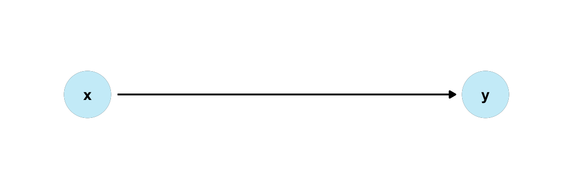
Figure 24.1: A causal diagram (or DAG) for “x causes y” or “y listens to x”.
Measuring the causal effect of x on y essentially asks for a numeric estimate of this arrow.
- Typical DAGs involve more than two variables and one arrow. A series of arrows form a path. The three types of paths in DAGs are known as forks, chains, and colliders (aka. inverse forks).
Figure 24.2 shows these three types of causal relationships (i.e., chains, forks, and colliders):
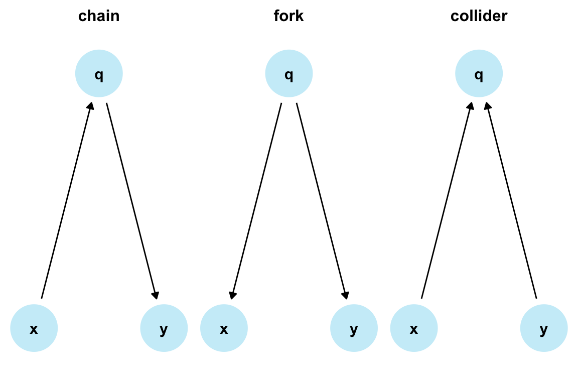
Figure 24.2: Three basic causal structures or DAGs.
In these DAGs, the direction of the arrows and the relationships of interest determine which type of path a series of variables represents:
chains represent direct causes. In chain paths, a series of arrows points in the same direction. The variable or node
qis called a mediator: it lies on the causal path fromxtoy. In our diagram, the only path fromxtoyis mediated throughq.forks represent a common or mutual cause of two variables. In fork paths, the arrows from
xtoypoint in different directions. In our diagram,qcauses bothxandy, so thatqis a confounder.colliders represent a mutual descendant of two variables. In collider paths, two arrowheads meet at one variable. As we have seen for forks, the arrows from
xtoypoint in different directions, but in the opposite direction than in forks (which is why colliders are also called reverse forks). This means that the collider variableqis caused by two other variables (andqitself often called a collider). Here,xandyboth causeq.
Additionally, we can also categorize DAGs into “open” vs. “closed” paths:
Paths that transmit association are open paths;
Paths that do not transmit association are closed paths.
Thus, chains and forks are open paths, while colliders are closed paths.
Quick demo structures
The ggdag package (Barrett, 2024) provides utility functions for quickly creating DAGs for demonstrating basic causal structures, including mediation_triangle(), confounder_triangle(), collider_triangle(), m_bias(), and butterfly_bias().
For instance:
24.2.4 Viewing DAGs through a statistical lens
When analyzing quantitative data, our interpretations and conclusions still rely on qualitative assumptions. This is especially true when dealing with observational data (i.e., data without randomized exposure to experimental conditions). The following section uses simulated data and either visualizations or simple linear regressions to illustrate the effects of bias, confounding, and of controlling for covariates.
When viewing causal structures through the lens of statistics, the simplest possible question concerns the relationship between two variables x and y.
If we only consider their correlation, we can characterize our three key DAGs from above as follows:
In the chain,
xandyare associated, but their relationship is mediated byq.In the fork,
xandyare associated, but there is no arrow pointing fromxtoy. As the mutual causeqcauses bothxandy,xandyare confounded byqand show a spurious association. Statistically adjusting forq(or “controlling” forq) will block the bias from confounding and reveal the true relationship betweenxandy.In the collider,
xandyare not associated. However, controlling forqhas the opposite effect than with confounding: It introduces bias.
What happens to the relation between x and y, when we statistically control for q?
The following examples illustrate the effects of controlling for q
on the relation between x and y for each of the three causal paths (see DAGs above).
1. Chains: Controlling for a mediator reveals direct effect
For chains, whether or not we adjust for mediators depends on the research question.
Here, adjusting for a mediator q results in a null estimate of the effect of x on y.
Because the only effect of x on y is via q, no other effect remains.
The effect of x on y mediated by q is called the indirect effect, while the effect of x on y directly is called the direct effect.
If we only care about a direct effect, controlling for q might be what we want.
But if we want to know about both effects, we should not adjust for q.
Figure 24.3 illustrates the difference between total and direct effects by adjusting for a mediator q:
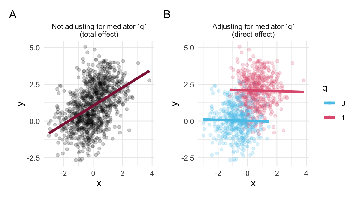
Figure 24.3: When an effect of x on y is mediated by q, adjusting for q reveals the direct effect, rather than the total effect.
Interpretation of Figure 24.3:
The unadjusted effect of
xony(in Panel A) represents the total (direct and indirect) effect.Since the total effect is entirely due to the path mediated by
q, no relationship remains when we adjust forq(in Panel B). This null effect is the direct effect.
Linear regression
The following code shows the difference between the total effect (of x on y, without adjustment for the mediator q)
and the direct effect (with adjustment for the mediator q) through a linear regression lens:
| Estimate | Std. Error | t value | Pr(>|t|) | |
|---|---|---|---|---|
| (Intercept) | 1.043 | 0.041 | 25.253 | 0 |
| x | 0.624 | 0.040 | 15.621 | 0 |
| Estimate | Std. Error | t value | Pr(>|t|) | |
|---|---|---|---|---|
| (Intercept) | 0.023 | 0.054 | 0.423 | 0.673 |
| x | -0.028 | 0.042 | -0.674 | 0.500 |
| q | 2.066 | 0.087 | 23.651 | 0.000 |
Note that both the total effect and the direct effect is real — and neither is due to bias. However, they address and answer different research questions.
2. Fork: Controlling for a confounder removes bias
In a fork, two variables x and y are not causing each other, but are both affected by a common cause q. If we naively measured the correlation between x and y, we may think that both variables are related. But this relationship can change, when controlling for the confounding influence of q.
Figure 24.4 illustrates the control/removal of bias by adjusting for a confounder q:
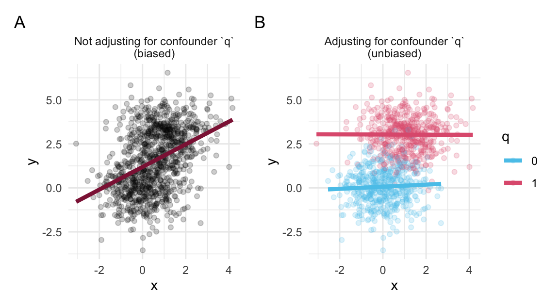
Figure 24.4: When an effect of x on y is confounded by q, adjusting for q removes the bias.
Interpretation of Figure 24.4:
xandyare not causing each other, but both affected by a mutual causeq. Statistically measuring the unadjusted effect ofy ~ x(in Panel A) yields a biased result, as it includes information aboutq.When controlling for
q, however (in Panel B), the bias disappears: Within each level ofq,xandyare unrelated.
Linear regression
The following code shows the difference between the biased effect (of x on y, without adjustment for the confounder q)
and the unbiased effect (with adjustment for the confounder q) through a linear regression lens:
| Estimate | Std. Error | t value | Pr(>|t|) | |
|---|---|---|---|---|
| (Intercept) | 1.188 | 0.058 | 20.403 | 0 |
| x | 0.644 | 0.047 | 13.663 | 0 |
| Estimate | Std. Error | t value | Pr(>|t|) | |
|---|---|---|---|---|
| (Intercept) | 0.067 | 0.046 | 1.457 | 0.145 |
| x | 0.026 | 0.033 | 0.775 | 0.439 |
| q | 2.932 | 0.074 | 39.769 | 0.000 |
3. Collider: Controlling for a collider introduces bias
Colliders differ from forks. In a collider, x and y are not associated, but both cause q. Adjusting for q has the opposite effect than with confounding:
It opens a biasing pathway.
Sometimes, people draw the path opened up by conditioning on a collider that connects x and y.
Figure 24.5 illustrates the introduction of bias by adjusting the continuous relationship between x and y for a (binary) collider q:
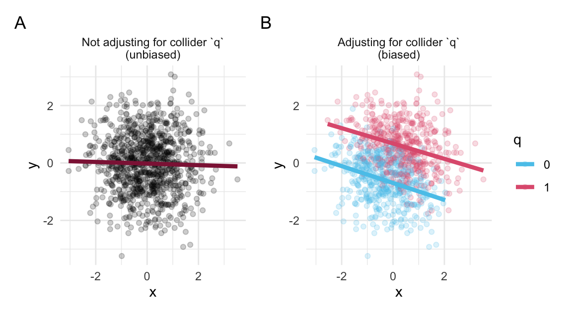
Figure 24.5: When x and y both cause / collide into q, adjusting for q introduces bias.
Interpretation of Figure 24.5:
When we do not include
q(in Panel A), we find no relationship betweenxandy. That’s the correct result (given the data-generating mechanism here):However, when we include
q(in Panel B), we can detect information about bothxandy, and they appear correlated (although they do not directly cause each other): Across levels ofx, those withq = 0have lower levels ofy. Paradoxically, this association seemingly flows back in time. Of course, that can’t happen from a causal perspective, so controlling forqis the wrong thing to do here. We end up with a biased effect ofxony.
Linear regression
The following code shows the difference between the unbiased effect (of x on y, without adjustment for the collider q)
and the biased effect (with adjustment for the collider q) through a linear regression lens:
| Estimate | Std. Error | t value | Pr(>|t|) | |
|---|---|---|---|---|
| (Intercept) | -0.020 | 0.032 | -0.649 | 0.516 |
| x | -0.028 | 0.032 | -0.885 | 0.376 |
| Estimate | Std. Error | t value | Pr(>|t|) | |
|---|---|---|---|---|
| (Intercept) | -0.693 | 0.035 | -19.748 | 0 |
| x | -0.281 | 0.026 | -10.768 | 0 |
| q | 1.376 | 0.052 | 26.454 | 0 |
In all three paths, the interpretation of the effect of x on y drastically changes if we adjust for a third variable q.
Conclusion
Real causal structures will typically involve more than three variables. But before we can start tackling more complicated scenarios, we ought to understand these basic ABC cases.
Importantly, our artificial and fictitious examples used known data-generating mechanisms.
Thus, they jointly illustrate that the effects and interpretation of controlling for a variable q differ depending on the data-generating mechanism.
Thus, we cannot determine the correct analysis or interpretation without considering the causal relations between the variables.
Continue with:
- Section 4.2 DAGs in R.
24.3 Conclusion
Felix, qui potuit rerum cognoscere causas
(Lucky is he who has been able to understand the causes of things)Virgil (29 BC) (from Pearl et al., 2016, p. xii)
24.3.1 Summary
Key points
Causal inference asks not just what goes with what, but why — and what would happen if we intervened:
Why causal inference
- Correlation does not imply causation: To explain outcomes, anticipate interventions, or assign credit, we need a model of the data-generating process, not just patterns in the data.
- Data alone are “profoundly dumb” (Pearl & Mackenzie, 2018) — drawing causal conclusions requires explicit, qualitative assumptions that we bring to the data.
The ladder of causation
- Pearl’s three rungs (Pearl & Mackenzie, 2018) distinguish levels of causal insight: seeing (associations: what goes with \(x\)?), doing (interventions: what if I do \(x\)?), and imagining (counterfactuals: what if I had done \(y\) instead?).
- Statistics and EDA mostly live on the first rung; causal models let us climb to the second and third.
Causal diagrams (DAGs)
- A directed acyclic graph (DAG) encodes our causal assumptions as nodes (variables) and edges (causal arrows) — directed because arrows point one way, acyclic because nothing causes itself.
- Paths take three basic shapes: chains (
x -> q -> y, whereqis a mediator), forks (x <- q -> y, whereqis a confounder), and colliders (x -> q <- y).
Adjusting for a third variable
- Whether “controlling for” a variable
qhelps or hurts depends entirely on the causal structure: it reveals a direct effect in a chain, removes confounding bias in a fork, but introduces bias in a collider. - Hence we cannot choose the correct analysis from the data alone — the causal assumptions (the DAG) must come first.
24.3.2 Resources

Add pointers to cheatsheets and additional links here.
Background readings
Foundational articles and books by Judea Pearl (e.g., Pearl, 2009; Pearl et al., 2016; Pearl & Mackenzie, 2018)
Introductory articles by Lübke et al. (2020) and McGowan et al. (2024)
R resources
The Causal inference in R blog, the Causal inference in R workshop and the corresponding textbook Causal Inference in R (by Malcolm Barrett, Lucy D’Agostino McGowan, and Travis Gerke)
Tutorial on Statistical Modeling and Causal Inference (by Simon Munzert, Lisa Oswald, and Sebastian Ramirez Ruiz, 2021)
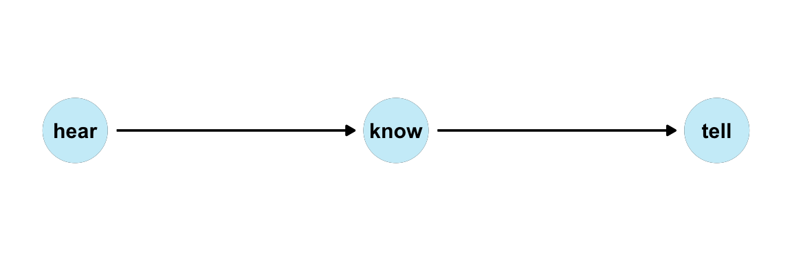
24.4 Exercises

24.4.1 Adjusting causes bias
This exercise is based on 3.1 Example 1: Adjusting causes bias of Lübke et al. (2020) (p. 134f., but with different labels):
Data (and data-generating mechanism):
- we hear: \(h = E_h\), with \(E_h ∼ \mathcal{N}(0, 1)\)
- we know: \(k = 5h + E_k\), with \(E_k ∼ \mathcal{N}(0, 1)\)
- we tell: \(t = 3k + E_t\), with \(E_t ∼ \mathcal{N}(0, 1)\)
where \(\mathcal{N}(\mu = 0, \sigma = 1)\) stands for the Normal distribution.
DAG
Linear regression analysis
# A. Total effect:
lm_1a <- stats::lm(tell ~ hear)
summary(lm_1a)$coefficients |> knitr::kable(digits = 3, label = NA, caption = "(\\#tab:causal-ex01-3a) A. Not adjusting for `know`")| Estimate | Std. Error | t value | Pr(>|t|) | |
|---|---|---|---|---|
| (Intercept) | -0.022 | 0.097 | -0.231 | 0.818 |
| hear | 15.121 | 0.098 | 154.585 | 0.000 |
# B. Adjust for mediator "know" (as covariate):
lm_1b <- lm(tell ~ hear + know)
summary(lm_1b)$coefficients |> knitr::kable(digits = 3, label = NA, caption = "(\\#tab:causal-ex01-3b) B. Adjusting for `know`")| Estimate | Std. Error | t value | Pr(>|t|) | |
|---|---|---|---|---|
| (Intercept) | -0.005 | 0.031 | -0.161 | 0.872 |
| hear | 0.122 | 0.163 | 0.748 | 0.455 |
| know | 2.982 | 0.032 | 94.026 | 0.000 |
24.4.2 Adjusting removes bias
This exercise is based on 3.2 Example 2: Adjusting removes bias of Lübke et al. (2020) (p. 135f., but with different labels):
Data (and data-generating mechanism):
-
IQ: Intelligence score \(I\) is noisy: \(I = U_I\), with \(U_I ∼ \mathcal{N}(100, 15)\) -
learn: Learning time \(L\) listens to \(I\): \(L = 200 − I + U_L\), with \(U_L ∼ \mathcal{N}(0, 1)\) -
test: Test score \(T\) listens to \(I\) and \(L\): \(T = (.50 \cdot I) + (.10 \cdot L) + U_T\), with \(U_T ∼ \mathcal{N}(0, 1)\)
DAG
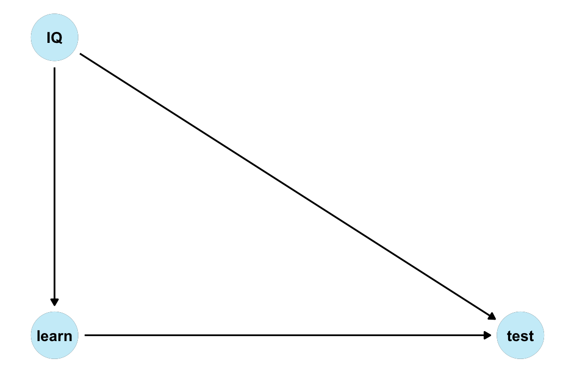
-
Note that
IQis a common cause of bothlearnandtest.
Linear regression analysis
# A. Biased effect (not adjusting for 'IQ'):
lm_2a <- lm(test ~ learn)
summary(lm_2a)$coefficients |> knitr::kable(digits = 3, label = NA, caption = "(\\#tab:causal-ex02-3a) A. Not adjusting for IQ")| Estimate | Std. Error | t value | Pr(>|t|) | |
|---|---|---|---|---|
| (Intercept) | 100.083 | 0.234 | 427.866 | 0 |
| learn | -0.401 | 0.002 | -173.920 | 0 |
# => A seemingly negative effect of 'learn' on 'test'!

# B. Adjust for common cause 'IQ' (as covariate):
lm_2b <- lm(test ~ learn + IQ)
summary(lm_2b)$coefficients |> knitr::kable(digits = 3, label = NA, caption = "(\\#tab:causal-ex02-3b) B. Adjusting for IQ")| Estimate | Std. Error | t value | Pr(>|t|) | |
|---|---|---|---|---|
| (Intercept) | 3.446 | 6.339 | 0.544 | 0.587 |
| learn | 0.082 | 0.032 | 2.577 | 0.010 |
| IQ | 0.484 | 0.032 | 15.253 | 0.000 |
# => True effect of 'learn' on 'test' is positive!24.4.3 Randomized experiments
This exercise is based on 3.4 Example 4: Randomized experiments of Lübke et al. (2020) (p. 136f., but with different labels):
Data (and data-generating mechanism):
IQ: Intelligence score \(I\) is noisy: \(I = U_I\), with \(U_I ∼ \mathcal{N}(100, 15)\)learn: Learning time is randomly set to be either 80 or 120: \(L = (U_L \cdot 80) + (1− U_L) \cdot 120\), with \(U_L ∼ \mathcal{B}(.50)\)test: Test score \(T\) listens to \(I\) and \(L\): \(T = (.50 \cdot I) + (.10 \cdot L) + U_T\), with \(U_T ∼ \mathcal{N}(0, 1)\)
DAG
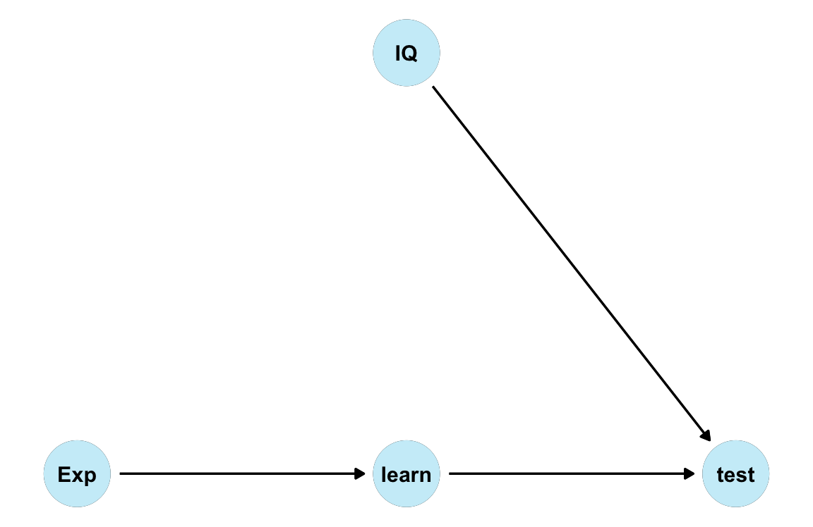
Descriptives
#> [1] -0.998
#> [1] 0.015| learn_exp | n | mn_IQ | mn_test_exp |
|---|---|---|---|
| 80 | 504 | 99.39 | 57.66 |
| 120 | 496 | 99.83 | 61.95 |
Linear regression analysis
| Estimate | Std. Error | t value | Pr(>|t|) | |
|---|---|---|---|---|
| (Intercept) | 49.079 | 1.200 | 40.884 | 0 |
| learn_exp | 0.107 | 0.012 | 9.100 | 0 |
| Estimate | Std. Error | t value | Pr(>|t|) | |
|---|---|---|---|---|
| (Intercept) | -0.029 | 0.262 | -0.109 | 0.913 |
| learn_exp | 0.102 | 0.002 | 65.034 | 0.000 |
| IQ | 0.499 | 0.002 | 235.985 | 0.000 |
| Estimate | Std. Error | t value | Pr(>|t|) | |
|---|---|---|---|---|
| (Intercept) | 9.924 | 0.487 | 20.386 | 0 |
| IQ | 0.501 | 0.005 | 103.559 | 0 |
Conclusion
No causation without manipulation
(Holland, 1986)
Experimental manipulation (of learn_exp) makes the effects interpretable.
24.4.4 More causal quartets
-
Variation quartets
The data
variation_causal_quartetdemonstrates that we can get the same average treatment effect despite variability across some pre-treatment characteristic (here calledcovariate):
| dataset | ATE |
|---|---|
| (1) Constant effect | 0.1 |
| (2) Low variation | 0.1 |
| (3) High variation | 0.1 |
| (4) Occasional large effects | 0.1 |
-
Heterogeneity quartets
The data
heterogeneous_causal_quartetdemonstrates how we can observe the same causal effect under different patterns of treatment heterogeneity:
| dataset | ATE |
|---|---|
| (1) Linear interaction | 0.1 |
| (2) No effect then steady increase | 0.1 |
| (3) Plateau | 0.1 |
| (4) Intermediate zone with large effects | 0.1 |
In both cases, create a visualization that illustrates what is really going on between covariate and outcome (grouped by exposure) in each dataset.
Sources: This exercise is based on Gelman et al. (2024) and data from the quartets package (D’Agostino McGowan, 2023).